Model sheets with unhelpful vague captions
I’m using Sketchtember as motivation to work on some character designs. These are rough and in progress.
I prefer not to give characters ‘stock’ outfits, and plan to play freely with outfits throughout the prompt challenge, so everyone is in some form of underwear on the reference sheets. Except for Mallory, whom I suppose is a never-nude?

Untitled fantasy WIP designs. Note: Nadja is the only one out of any of these charactesr who is not an adult, so in retrospect, I didn’t have to label everyone’s life stage on her account.

Untitled 1970s-era anthro world project. I can’t describe anything about it without sounding kind of insane, but yes, the two ladies do get mistaken for a chipmunk and a squirrel and it kind of annoys them.
(Note: In general I don’t have set plans for what will change about these designs, I expect them to naturally improve and refine through iteration as I work through the prompts. But I’m probably going to intentionally tweak Polly’s color scheme. Also, I did repurpose the robot arm from a past design so if you recognize it, it’s either because it’s elsewhere on my site or because it’s not really that unique looking)

And finally, aliens.
Apparently the four personality types on this blog are ‘neutral’, ‘crabby’, ‘troubled’ and ‘smug’.
Sketch prompts will be posted on my Tumblr and Instagram first and then those worthy of collecting will be collected on the collections page at the end of the month! This is a challenge directed at rough no-pressure art so some of the pieces may not be selected for the site.
Kila with lineart tests
I’ve found that how my art looks to me can change quite a bit depending on inking method. Every so often I do a series of comparisons- this one was inspired by seeing one of those art videos where someone says pencils can be cleaned up and used as inks.

Pencils used to substitute for inks. This always sounds so appealing but I tend not to like the results… my pencils are incredibly messy. Maybe this would be a better look for a character/style that are more detailed- I find that my eyes go right to any messy or wonky lines. The pencil “inks” are also less efficient for coloring because they’re rough.

This is digital lineart with the stabilization turned all the way off. This gives me more control over my lines and keeps the computer from distorting what I drew, but results in a bit of visible jitter. I’m not sure how much to dislike the jitter. On one hand, it kind of looks like the line jitter in Peanuts, which (although it gives the strip an endearing quality and a characteristic look) was also not intentional, and I think anything reminiscient of Peanuts is probably a plus- but on the other hand it kind of looks like I don’t know how to use a tablet.
The eternal advantage of digital art is that you can make it as perfect as you want. However, too-perfect lines can result in stiff, clinical-looking work, so the eternal disadvantage of digital art is also that you can make it as perfect as you want.

This is a disposable Tombow Fudenosuke brush pen, which I usually drift towards as a happy medium between too-sloppy pencils and too-perfect digital inks. (This pen was starting to go dry, so there are more visible rough lines than usual. I could have fixed them, of course, but this was just a quick test.) Sometimes these inks can turn out a little bit blocky or heavy after being scanned and processed- maybe there’s something I should be doing differently during cleanup.
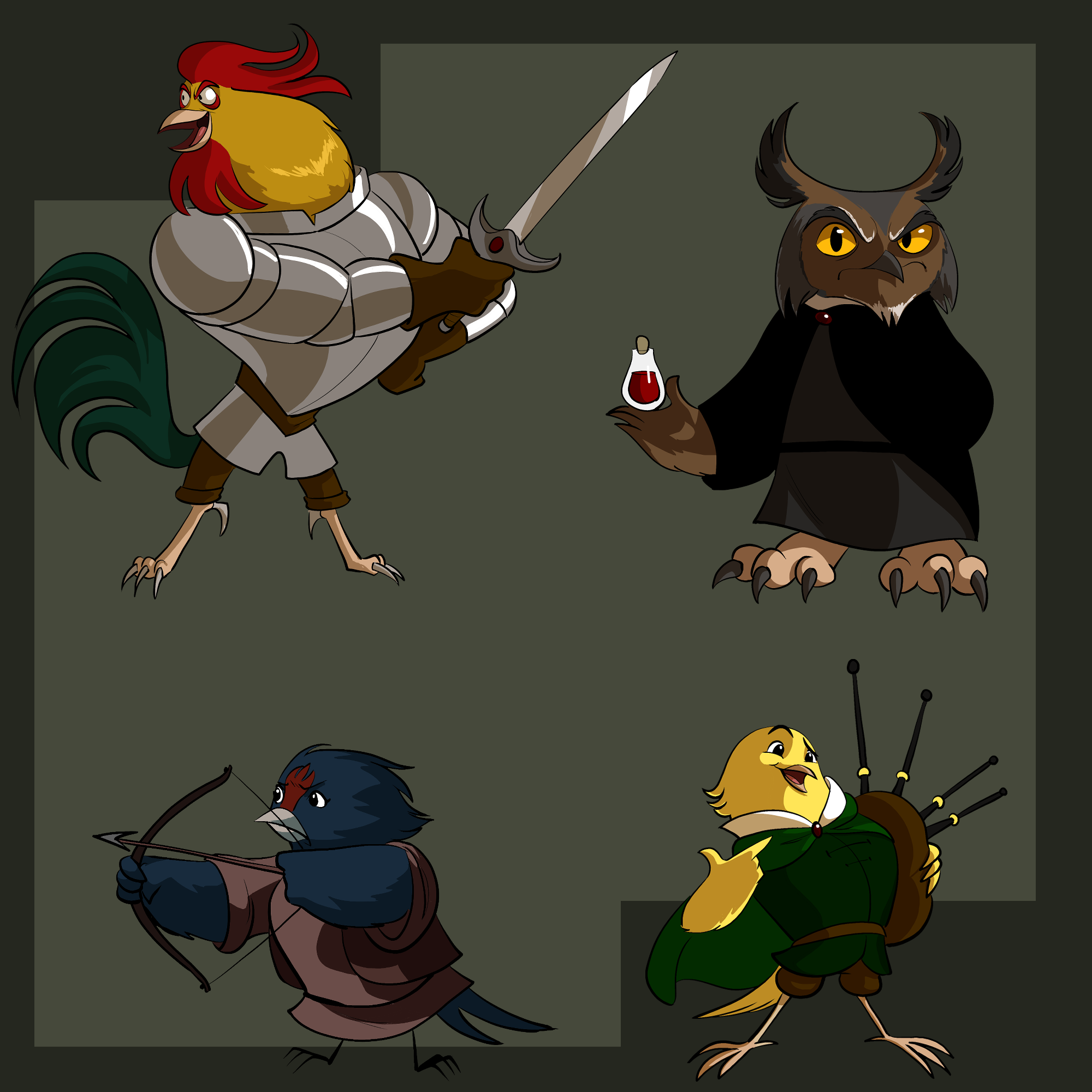
Birds with fantasy archetypes
Tools used: Clip Studio Paint, XP-Pen Artist 13.3 Pro tablet monitor
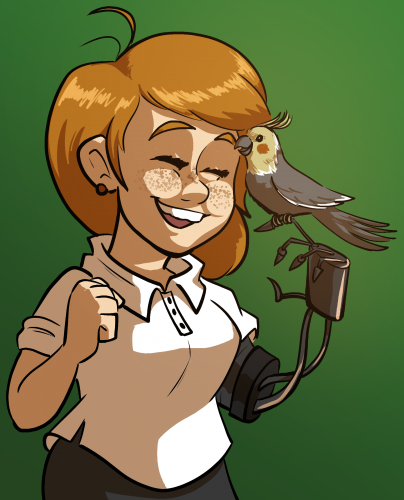
Girl with cockatoo
Did this as a contest entry a while back
Cat with butterflies

A doodle testing out a pack of pastel Copic Ciaos- I don’t usually spring for copics, but they were on sale and I seem to never have enough pastels.